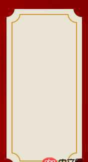
這種凹角用css3如何實現
問題描述
問題解答
回答1:<!DOCTYPE html><html lang='en'><head> <meta charset='UTF-8'> <title>Title</title> <style>.outer{ position: absolute; left: 100px; top: 100px; width: 300px; height: 500px; background-color: #0a6ebd; display: flex; justify-content: center; align-items: center; box-sizing: border-box; border: 1px solid #0a6ebd;}.inner-1{ width: 250px; height: 450px; box-sizing: border-box; background-color: #0da6ec; position: relative; display: flex; justify-content: center; align-items: center; border: 1px solid red; border-top-left-radius: 25px;}.inner-2{ width: 200px; height: 400px; box-sizing: border-box; background-color: #00bcd4; position: relative; border: 1px solid red; border-top-left-radius: 25px;}.left-corner{ width: 25px; height: 25px; /* border-radius: 100%; */ border-bottom-right-radius: 100%; background-color: inherit; position: absolute; left: -1px; top: -1px; z-index: 10; border-bottom: 1px solid red; border-right: 1px solid red; box-sizing: border-box;} </style></head><body> <p class='outer'><p class='inner-1'> <p style=' background-color: #0a6ebd;'></p> <p class='inner-2'><p style='background-color: #0da6ec;'></p> </p></p> </p></body></html>回答2:
<!DOCTYPE html PUBLIC '-//W3C//DTD XHTML 1.0 Transitional//EN' 'http://www.w3.org/TR/xhtml1/DTD/xhtml1-transitional.dtd'><html xmlns='http://www.w3.org/1999/xhtml' xml:lang='en'><head> <meta http-equiv='Content-Type' content='text/html;charset=UTF-8'> <title>css</title></head><body><style>#a { width: 150px; height: 300px; background: radial-gradient(circle at top left, transparent 15px, #e6e4b7 0) top left, radial-gradient(circle at top right, transparent 15px, #e6e4b7 0) top right, radial-gradient(circle at bottom right, transparent 15px, #e6e4b7 0) bottom right, radial-gradient(circle at bottom left, transparent 15px, #e6e4b7 0) bottom left; background-size: 50% 50%; background-repeat: no-repeat; padding: 20px 24px 22px 20px;}#b { display: block; background: radial-gradient(circle at top left, transparent 15px, red 0) top left, radial-gradient(circle at top right, transparent 15px, red 0) top right, radial-gradient(circle at bottom right, transparent 15px, red 0) bottom right, radial-gradient(circle at bottom left, transparent 15px, red 0) bottom left; background-size: 50% 50%; background-repeat: no-repeat; width:100%; height: 100%; padding: 2px;}#b:before { content: ''; width: 100%; height: 100%; display: block; background: radial-gradient(circle at top left, transparent 15px, #e6e4b7 0) top left, radial-gradient(circle at top right, transparent 15px, #e6e4b7 0) top right, radial-gradient(circle at bottom right, transparent 15px, #e6e4b7 0) bottom right, radial-gradient(circle at bottom left, transparent 15px, #e6e4b7 0) bottom left; background-size: 50% 50%; background-repeat: no-repeat;}</style> <p id='a'><p id='b'></p> </p></body></html>回答3:
假設這個p id是a
#a { width: 100px; height: 300px; background: radial-gradient(circle at top left, transparent 8px, #e6e4b7 0) top left, radial-gradient(circle at top right, transparent 8px, #e6e4b7 0) top right, radial-gradient(circle at bottom right, transparent 8px, #e6e4b7 0) bottom right, radial-gradient(circle at bottom left, transparent 8px, #e6e4b7 0) bottom left; background-size: 50% 50%; background-repeat: no-repeat;}
具體參數自己調一下
回答4:border-radius?
回答5:這個是橫著的,但也比較接近了:http://jsfiddle.net/x4wLf/
相關文章:
1. python - pycharm 自動刪除行尾空格2. python - Pycharm的Debug用不了3. python 利用subprocess庫調用mplayer時發生錯誤4. html - eclipse 標簽錯誤5. datetime - Python如何獲取當前時間6. javascript - 有適合開發手機端Html5網頁小游戲的前端框架嗎?7. 安全性測試 - nodejs中如何防mySQL注入8. python文檔怎么查看?9. javascript - 關于apply()與call()的問題10. python - pandas按照列A和列B分組,將列C求平均數,怎樣才能生成一個列A,B,C的dataframe
 網公網安備
網公網安備